Navigation
Install the app
How to install the app on iOS
Follow along with the video below to see how to install our site as a web app on your home screen.
Note: This feature may not be available in some browsers.
More options
Style variation
You are using an out of date browser. It may not display this or other websites correctly.
You should upgrade or use an alternative browser.
You should upgrade or use an alternative browser.
Livery Design Threads
- Thread starter Rorie
- Start date
- Thread starter
- #23
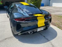
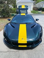
Thank you. The stripes are wider than the European Type 25 edition, and I thought the stripes on that edition were too narrow. The Clark Edition has wider stripes and I think that looks better, and I can tell from the stripe width compared to the rear LOTUS lettering that your stripes are pretty close in width to the Clark Edition and I think you made a really good choice.Front and back as requested
Similar threads
- Replies
- 12
- Views
- 2K


